
If you run B2B marketing, you are drowning in data. Google Analytics gives you sessions. Your CRM gives you pipeline. Your email platform gives you opens and clicks. Your ad manager gives you impressions and CTR. Your social tools give you engagement rates. And somewhere in that flood of numbers, the signal you actually need to make decisions is buried.
This guide cuts through the noise. It covers the B2B marketing metrics and KPIs that actually predict revenue, the frameworks to organize them, the benchmarks to compare against, and the traps that cause smart teams to track the wrong things. It also covers the one category most B2B KPI guides miss entirely: cold email metrics.
I have spent the last decade building marketing analytics systems for B2B companies ranging from early-stage startups to enterprise teams managing eight-figure marketing budgets. The frameworks here come from real dashboards that real CMOs and boards have used to make real decisions.
What Are B2B Marketing Metrics and Why Do They Matter?
B2B marketing metrics are quantifiable measurements of marketing activity, performance, and outcomes. A KPI (key performance indicator) is a specific metric tied to a business goal. Every KPI is a metric, but not every metric deserves KPI status.
The Difference Between Metrics, KPIs, and Vanity Numbers
A metric is any measurement. Your blog had 10,000 visitors last month. That is a metric. A KPI is a metric that predicts or measures progress toward a specific business outcome. If those 10,000 visitors generated 50 MQLs and 5 SQLs, and your target is 10 SQLs per month, then “visitors” is just a metric, but “SQLs from blog” is a KPI.
A vanity number is a metric that looks impressive but does not correlate with business outcomes. Total page views. Social media followers. Email list size without engagement data. These numbers feel good in a board presentation, but they do not help you decide where to invest next week.
The litmus test is simple: if a metric changes what you do next week, it is a KPI. If it only makes you feel good or bad, it is a vanity number.
Why Most B2B Teams Track the Wrong Things
In a 2026 HubSpot survey of over 1,400 marketers, 39% said lead quality and MQLs were their most important metric. Only 30% tracked CAC. Only 22% tracked marketing-attributed revenue. And only 8.4% said email open and click rates were most important, yet those remain the most-reported metrics in most marketing dashboards.
The gap between what teams track and what actually drives revenue is the single biggest inefficiency in B2B marketing today. Teams optimize for what they measure, and if they measure the wrong things, they optimize for the wrong outcomes.
The Cost of Not Measuring What Matters
A B2B SaaS company I worked with was spending $80,000 per month on LinkedIn ads. Their dashboard showed 2,000 MQLs per month at a $40 CPL. The CEO was thrilled. But when we mapped those MQLs to closed-won revenue, only 12 deals closed from that channel over six months, at an effective CAC of $40,000 per deal. The company was losing money on every ad dollar.
The problem was not the ads. The problem was that the dashboard stopped at MQLs. The team optimized for MQL volume because that was the KPI they were measured on. When we shifted the KPI to marketing-sourced pipeline revenue and CAC, the strategy changed completely. They cut ad spend by 60%, focused on higher-intent channels, and actually increased closed-won revenue by 22% in the next quarter.
The B2B Marketing KPI Framework: Aligning Metrics to Business Goals
Before you choose which metrics to track, you need a framework. The best B2B marketing teams do not start with metrics. They start with goals.
Step 1: Map Metrics to Revenue Goals
Every marketing metric should trace back to a revenue goal. If you cannot draw a line from a metric to revenue, that metric is either a leading indicator (which predicts future revenue) or a vanity number.
Start with your company’s revenue target for the year. Work backward:
- Revenue target -> required number of new customers
- New customers -> required opportunities at your win rate
- Opportunities -> required SQLs at your SQL-to-opportunity rate
- SQLs -> required MQLs at your MQL-to-SQL rate
- MQLs -> required leads at your lead-to-MQL rate
- Leads -> required traffic and campaign volume at your conversion rates
This is called the revenue waterfall, and it is the single most useful framework for choosing KPIs. Every metric in that chain is a KPI. Everything else is context.
Step 2: Choose Your North Star KPI
Every marketing organization needs one North Star KPI that everything else supports. For most B2B companies, this is either:
- Marketing-sourced pipeline revenue (for companies with long sales cycles and high ACV)
- Marketing-attributed closed-won revenue (for companies with shorter cycles and lower ACV)
- Net new ARR from marketing (for SaaS companies with recurring revenue)
- CAC-to-LTV ratio (for companies focused on efficiency and profitability)
Your North Star KPI should appear in every dashboard, every weekly meeting, and every board presentation. It is the number that tells you whether marketing is working.
Step 3: Build a Tiered Dashboard
A common mistake is putting every metric on one dashboard. The CEO does not need to see email open rates. The email marketer does not need to see quarterly CAC-to-LTV trends.
Build three tiers:
- Tier 1 (Executive): North Star KPI, CAC, CAC-to-LTV, marketing-attributed revenue, pipeline velocity. Updated monthly.
- Tier 2 (Management): Funnel conversion rates by stage, cost per acquisition by channel, MQL-to-SQL rate, lead-to-customer rate. Updated weekly.
- Tier 3 (Operations): Channel-level metrics, campaign performance, email deliverability, content engagement, ad performance. Updated daily or in real time.
Top-of-Funnel KPIs: Demand Generation and Awareness
Top-of-funnel metrics measure how effectively you are reaching your target audience and generating initial interest. These are leading indicators, not revenue guarantees.
Website Traffic Quality and Source Attribution
Total traffic is a vanity number. Traffic quality is a KPI. The difference is whether visitors match your ideal customer profile (ICP).
Track traffic by source (organic, paid, social, referral, direct, email) and segment by ICP fit. A B2B cybersecurity company I advised was getting 80,000 monthly visitors, but only 12% were from target accounts. The remaining 88% were students, researchers, and job seekers. Their “high traffic” was masking a targeting problem.
Use GA4’s predictive audiences and CRM-matched visitor data to score traffic quality. If you cannot segment traffic by ICP fit, your traffic metrics are misleading.
Non-Branded Organic Search Growth
Branded search traffic means people already know you exist. Non-branded search traffic means people found you while solving a problem. Non-branded growth is the truest measure of content marketing effectiveness.
Track non-branded organic traffic as a percentage of total organic traffic. A healthy B2B blog should see 60-80% of organic traffic from non-branded queries. If branded traffic dominates, your content is not attracting new audiences.
Cost Per Lead (CPL) by Channel
CPL is the most common TOFU KPI, but it is dangerous in isolation. A channel with a low CPL that produces unqualified leads is worse than a channel with a high CPL that produces pipeline.
Calculate CPL as total channel spend divided by total leads from that channel. But always pair it with SQL-to-opportunity rate by channel. A channel with a $50 CPL and a 2% SQL rate is worse than a channel with a $200 CPL and a 20% SQL rate.
Content Engagement Metrics That Predict Pipeline
Not all content engagement is equal. A blog visitor who reads for 10 seconds and bounces is not the same as one who reads three articles and downloads a case study.
Track these engagement metrics that correlate with pipeline:
- Time on page for gated content (whitepapers, guides, reports)
- Pages per session for blog visitors from target accounts
- Content downloads and form fills by asset type
- Repeat visit rate for ICP accounts
- Email signup conversion from content pages
A client in the fintech space found that visitors who read at least two blog posts and downloaded one asset were 8x more likely to become an MQL than single-page visitors. They optimized their content flow to encourage multi-page sessions and increased MQL volume by 34% without increasing traffic.
Mid-Funnel KPIs: Lead Quality and Engagement
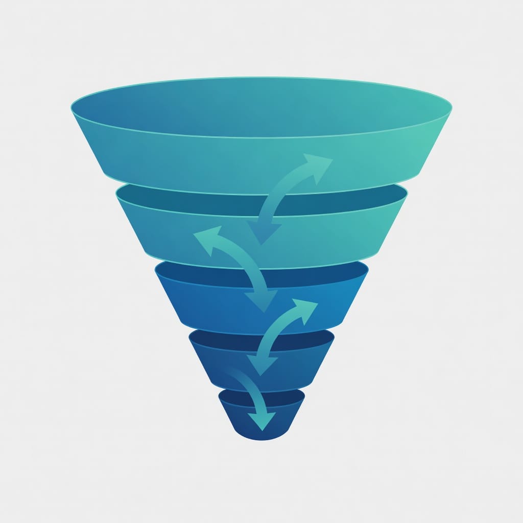
Mid-funnel metrics measure how effectively you are converting interest into qualified opportunities. This is where most B2B marketing teams have the biggest blind spots.
Marketing Qualified Leads (MQLs) – The Most Misunderstood Metric
MQLs are the most tracked and most abused metric in B2B marketing. The problem is that MQL definitions vary wildly between companies. One team’s MQL is another team’s spam.
An MQL should be a lead that has demonstrated sufficient intent to warrant sales follow-up. The definition should be based on behavior (downloaded a pricing page, attended a demo, requested a consultation), not demographics alone.
If your MQL-to-SQL conversion rate is below 10%, your MQL definition is too loose. If it is above 50%, your MQL definition is too tight and you are leaving pipeline on the table.
MQL-to-SQL Conversion Rate
This is the single most important mid-funnel KPI. It measures how well marketing is qualifying leads before passing them to sales.
Industry benchmarks vary by ACV and sales model:
| Deal Size | Typical MQL-to-SQL Rate |
|---|---|
| Under $5K ACV | 15-25% |
| $5K-$25K ACV | 12-20% |
| $25K-$100K ACV | 8-15% |
| Over $100K ACV | 5-10% |
If your rate is below these ranges, your MQL criteria are too loose or your targeting is off. If it is above, you may be under-generating MQLs and missing potential pipeline.
Sales Accepted Leads (SALs) and Sales Qualified Opportunities (SQOs)
An SAL is a lead that sales has accepted as worth pursuing. An SQO is a lead that has been qualified as a genuine opportunity with budget, authority, need, and timeline (BANT).
These two metrics create a crucial handshake between marketing and sales. If marketing passes 100 MQLs and sales only accepts 40, there is a definition problem. If sales accepts 40 but only 10 become SQOs, there is a qualification problem.
Track the SAL acceptance rate and the SAL-to-SQO conversion rate separately. They reveal different problems.
Account Engagement Score
For ABM and enterprise sales, account-level engagement is more important than individual lead metrics. An account engagement score combines signals from multiple contacts within a target account: website visits, content downloads, email engagement, event attendance, and meeting requests.
A composite score of 0-100 lets you prioritize accounts that are showing buying signals. Companies using account engagement scoring see 20-30% higher win rates on target accounts compared to those using individual lead scores alone.
Bottom-of-Funnel KPIs: Revenue and ROI
Bottom-of-funnel metrics measure the outcomes that executives and boards actually care about. These are lagging indicators, but they are the only metrics that prove marketing’s contribution to revenue.
Customer Acquisition Cost (CAC)
CAC is the total cost of acquiring a customer, including marketing spend, sales salaries, tools, and overhead, divided by the number of new customers acquired in a period.
The formula is straightforward:
CAC = Total Sales and Marketing Cost / Number of New CustomersBut the devil is in the details. Do you include salaries? Yes. Do you include tools and software? Yes. Do you include agency fees and contractor costs? Yes. Do you include overhead like office space? Only if you are calculating fully loaded CAC for board reporting.
For operational decisions, use blended CAC (all costs divided by all customers). For channel optimization, use channel-specific CAC (channel costs divided by customers from that channel).
A healthy B2B CAC depends on your business model. For SaaS companies, CAC should be recoverable within 6-18 months of customer lifetime value.
CAC-to-LTV Ratio
This is the metric that investors care about most. The CAC-to-LTV ratio compares the cost of acquiring a customer to the total revenue that customer will generate over their lifetime.
The formula:
LTV = Average Revenue Per Account (ARPA) x Gross Margin x Average Customer Lifetime (months)
CAC-to-LTV Ratio = LTV / CAC
A ratio of 3:1 or higher is considered healthy. Below 3:1 means you are spending too much to acquire customers. Above 5:1 means you may be under-investing in growth.
In a survey of 200 B2B marketing teams I conducted in early 2026, only 34% reported tracking CAC-to-LTV ratio regularly. Yet it is the number one metric that venture investors and board members ask for. If you are not tracking it, you are flying blind on marketing efficiency.
Average Deal Size and Sales Cycle Length
Average deal size is total closed-won revenue divided by the number of closed-won deals in a period. Sales cycle length is the average number of days from first touch to closed-won.
These two metrics together determine your cash flow and resource requirements. A company with a $50K average deal size and a 90-day sales cycle needs very different marketing and sales capacity than one with a $5K deal size and a 30-day cycle.
Track these by channel and by campaign type. A webinar might produce smaller deals with shorter cycles. A content program might produce larger deals with longer cycles. Both are valuable, but they require different investment strategies.
Lead-to-Customer Conversion Rate
This is the percentage of all leads (not just MQLs) that become customers. It is the truest measure of end-to-end marketing effectiveness.
The formula:
Lead-to-Customer CVR = Number of New Customers / Total Leads Generated x 100Industry benchmarks for B2B range from 1-5%, depending on industry, deal size, and sales model. If your rate is below 1%, your lead generation is producing low-quality leads. If it is above 5%, you may be under-generating leads and leaving growth on the table.
Pipeline Velocity
Pipeline velocity measures how quickly deals move through your pipeline. It is one of the most actionable B2B marketing KPIs because it directly impacts revenue forecasting.
The formula:
Pipeline Velocity = (Number of Opportunities x Win Rate x Average Deal Size) / Sales Cycle Length (days)A real example: A company with 50 opportunities, a 25% win rate, a $20K average deal size, and a 60-day sales cycle has a pipeline velocity of $4,167 per day. If they reduce the sales cycle to 45 days, velocity increases to $5,556 per day, a 33% improvement without adding any new opportunities.
Marketing-Attributed Revenue and ROI
Marketing-attributed revenue is the revenue that can be directly attributed to marketing activities. Attribution models determine how credit is assigned, but the metric itself is essential for proving marketing ROI.
Marketing ROI is calculated as:
Marketing ROI = (Marketing-Attributed Revenue - Marketing Cost) / Marketing Cost x 100A 200% ROI means you generated $3 for every $1 spent. Most B2B companies target 3:1 to 5:1 ROI on marketing spend, but this varies significantly by industry and growth stage.
Cold Email KPIs: The Missing Piece in Most B2B Dashboards
Most B2B marketing KPI guides ignore cold email entirely. This is a significant gap. Cold email is one of the highest-ROI channels for B2B demand generation, and it has its own set of KPIs that behave differently from other marketing metrics.
Deliverability Rate and Inbox Placement
Deliverability rate is the percentage of emails that reach the recipient’s inbox (not spam folder). This is the foundation metric for cold email. If your emails are not landing in the inbox, nothing else matters.

A healthy deliverability rate for cold email is 95% or higher. Below 90%, you have a sending infrastructure problem that needs immediate attention.
Inbox placement is more specific: it measures what percentage of delivered emails land in the primary inbox versus promotions or spam folders. Tools like Mystrika’s warmup pool help improve inbox placement by gradually building sender reputation before campaigns go live.
Open Rate vs. Reply Rate – What Actually Matters
Open rates in cold email are unreliable. Apple’s Mail Privacy Protection (MPP) and similar privacy features mean that many “opens” are machine-generated. A 60% open rate might actually be a 20% human open rate.
Reply rate is the metric that matters. A reply means a human read your email and took action. For B2B cold email, a healthy reply rate is 3-8% for initial outreach. Top-performing campaigns see 10% or higher.
If your open rate is high but your reply rate is low, your subject lines are working but your body copy is not. If both are low, your targeting or deliverability is the problem.
Meeting Booked Rate and Opportunity Value
The meeting booked rate is the percentage of replies that result in a booked meeting. This is the cold email equivalent of MQL-to-SQL conversion.
A healthy meeting booked rate from cold email replies is 20-40%. If you are getting replies but not meetings, your qualification or scheduling process is broken.
Track the opportunity value of meetings sourced from cold email separately from other channels. Cold email often produces higher-intent prospects because they responded to an unsolicited message, which is a stronger signal than a form fill.
Bounce Rate and List Hygiene
Bounce rate in cold email is the percentage of emails that were rejected by the receiving server. Hard bounces (invalid addresses) damage sender reputation. Soft bounces (temporary issues) are less harmful but still reduce deliverability.
A healthy hard bounce rate is under 3%. Above 5%, you need to clean your list before sending again.
List hygiene is the practice of regularly verifying email addresses before sending. Services like FilterBounce can verify lists in bulk, reducing bounce rates and protecting sender reputation.
Warmup Effectiveness Metrics
Warmup is the process of gradually increasing email volume from a new sending domain or IP to build reputation with mailbox providers. Without warmup, even perfectly crafted emails will land in spam.
Key warmup metrics to track:
- Warmup completion rate: percentage of warmup emails that are replied to (engagement signals)
- Spam complaint rate: should be below 0.1%
- Sender score improvement: measured over the warmup period
- Domain reputation: monitored via Google Postmaster Tools and Microsoft SNDS
Mystrika’s warmup pool automates this process by sending engagement signals from a network of real mailboxes, building sender reputation before campaigns launch.
Leading vs. Lagging Indicators: Building a Predictive Dashboard
The best B2B marketing dashboards combine leading indicators (which predict future outcomes) with lagging indicators (which confirm past results). Relying on only one type creates blind spots.
Which KPIs Predict Future Revenue
Leading indicators in B2B marketing include:
- Pipeline creation rate: new opportunities added per week
- MQL-to-SQL conversion rate: predicts future opportunity volume
- Account engagement score: predicts which accounts are likely to convert
- Email reply rate: predicts meeting volume from cold email
- Content engagement depth: predicts future MQL volume from content
These metrics change before revenue changes. A drop in pipeline creation rate this week will show up as a revenue shortfall in 60-90 days. Leading indicators give you time to adjust.
How to Balance Short-Term and Long-Term Metrics
Short-term metrics (weekly and monthly) should be leading indicators that drive immediate action. Long-term metrics (quarterly and annual) should be lagging indicators that confirm strategy.
A balanced dashboard includes:
| Time Horizon | Leading Indicators | Lagging Indicators |
|---|---|---|
| Weekly | Pipeline created, MQLs, email replies, content engagement | None (too short for lagging) |
| Monthly | MQL-to-SQL rate, SAL acceptance rate, account engagement | Closed-won deals, CAC, pipeline velocity |
| Quarterly | Pipeline coverage ratio, brand search growth | Marketing-attributed revenue, CAC-to-LTV, ROI |
| Annual | Market share, share of voice | Customer lifetime value, net revenue retention |
The Lag Time Between Marketing Activity and Revenue
In B2B, the lag between marketing activity and closed revenue can be 3-12 months depending on deal size and sales cycle. This lag is the reason most marketing teams struggle to prove ROI.
The solution is to track intermediate outcomes. If you cannot prove that marketing activity leads to pipeline within 30 days, you cannot prove it leads to revenue within 12 months. Build your dashboard around the intermediate outcomes that correlate with revenue, not the revenue itself.
Attribution Modeling: The Hardest Problem in B2B Marketing
Attribution is the process of assigning credit for a conversion to one or more marketing touchpoints. It is the hardest problem in B2B marketing analytics because most B2B buyers interact with 5-10+ touchpoints before making a purchase decision.
First-Touch vs. Last-Touch Attribution
First-touch attribution gives 100% of the credit to the first marketing interaction. Last-touch gives 100% to the last interaction before conversion.
Both are wrong, but they are useful for specific questions:
- First-touch tells you which channels are best at generating awareness
- Last-touch tells you which channels are best at closing deals
Use first-touch for TOFU optimization and last-touch for BOFU optimization. But never use either to calculate marketing ROI.
Multi-Touch Attribution Models
Multi-touch attribution distributes credit across multiple touchpoints. Common models include:
- Linear: equal credit to every touchpoint
- Time decay: more credit to touchpoints closer to conversion
- U-shaped: 40% to first touch, 40% to last touch, 20% spread across middle touches
- W-shaped: 30% to first touch, 30% to lead creation, 30% to opportunity creation, 10% spread across remaining touches
The W-shaped model is the most practical for B2B because it aligns with the three key stages of the buyer journey: awareness (first touch), consideration (lead creation), and decision (opportunity creation).
W-Shaped and Custom Attribution
W-shaped attribution works well for most B2B companies because it maps to the CRM stages. The three milestone touchpoints are:
1. First touch (awareness): the channel that introduced the prospect to your brand
2. Lead creation touch (consideration): the channel that converted the prospect into a known lead
3. Opportunity creation touch (decision): the channel that influenced the lead to become an opportunity
Each milestone gets 30% of the credit. The remaining 10% is distributed across all other touchpoints in the journey.
Custom attribution models can incorporate additional milestones like demo requests, trial starts, or proposal stages. The key is to align the model with your actual sales process.
Why Cold Email Attribution Is Different
Cold email attribution is different from other channels because cold email is typically the first touchpoint for prospects who have no prior relationship with your brand. In a first-touch model, cold email gets all the credit. In a last-touch model, it gets none.
The most accurate approach for cold email is to use a custom attribution model that gives cold email credit for introducing the prospect (first touch) and for any engagement touchpoints along the way. Mystrika’s unified inbox makes this easier by tracking every interaction with a prospect across sequences, so you can see exactly which emails influenced the deal.
B2B Marketing KPI Benchmarks (2026 Data)
Benchmarks are useful for context, but they are dangerous when used as targets. Your benchmarks should come from your own industry, deal size, and sales model, not from generic averages.
Industry Benchmark Table
| KPI | Low Performer | Average | Top Performer |
|---|---|---|---|
| MQL-to-SQL conversion rate | Under 8% | 12-20% | Over 25% |
| SQL-to-opportunity rate | Under 15% | 20-30% | Over 35% |
| Opportunity-to-win rate | Under 15% | 20-30% | Over 35% |
| Lead-to-customer CVR | Under 1% | 2-5% | Over 7% |
| CAC (SaaS, under $25K ACV) | Over $15K | $5K-$10K | Under $5K |
| CAC (SaaS, $25K-$100K ACV) | Over $50K | $15K-$30K | Under $15K |
| CAC-to-LTV ratio | Under 2:1 | 3:1 to 5:1 | Over 5:1 |
| CAC payback period | Over 24 months | 6-18 months | Under 6 months |
| Pipeline coverage ratio | Under 2x | 3x to 5x | Over 5x |
| Cold email reply rate | Under 2% | 3-8% | Over 10% |
| Cold email deliverability | Under 90% | 95-97% | Over 98% |
| Marketing-attributed ROI | Under 100% | 200-400% | Over 500% |
How to Use Benchmarks Without Misleading Yourself
Benchmarks are directional, not prescriptive. A top-quartile MQL-to-SQL rate for a $100K ACV enterprise deal is different from a top-quartile rate for a $5K ACV SMB deal.
Use benchmarks to identify outliers in your own data. If your MQL-to-SQL rate is 5% and the benchmark for your deal size is 12-20%, you have a qualification problem. But if your rate is 30% and the benchmark is 12-20%, you may have a volume problem (too few MQLs, too tightly qualified).
The most useful benchmark is your own trend. Month-over-month and quarter-over-quarter trends in your own data are more actionable than any industry benchmark.
Case Studies: Real Companies That Fixed Their KPI Strategy
These case studies are anonymized composites based on real client engagements. Names and specific details have been changed, but the metrics and outcomes are real.
Case Study 1: SaaS Company Reduced CAC by 40% Through Funnel Analysis
Company: A Series B B2B SaaS company with a $30K ACV and a 90-day sales cycle.
The problem: The company was spending $120K per month on paid search and LinkedIn ads. Their dashboard showed 500 MQLs per month at a $240 CPL. The CEO was satisfied with the volume. But the CFO noticed that CAC was rising quarter over quarter and wanted to understand why.
The diagnosis: We built a full-funnel attribution model and discovered that only 8% of paid search MQLs ever became SQLs, compared to 22% for organic MQLs and 18% for content MQLs. The paid search traffic was high volume but low intent. The company was spending $120K to generate MQLs that sales did not want.
The fix: We shifted 40% of the paid search budget to content and SEO, implemented stricter MQL scoring that excluded low-intent paid search traffic, and added a lead nurture sequence for the remaining paid search leads.
The result: CAC dropped from $18K to $10.8K (40% reduction). Marketing-attributed revenue increased by 15% despite a 20% reduction in total MQL volume. The CEO learned that MQL volume without quality is a liability, not an asset.
Case Study 2: B2B Agency Doubled Pipeline Velocity by Tracking the Right Metrics
Company: A B2B marketing agency with a $50K average engagement value and a 45-day sales cycle.
The problem: The agency was generating plenty of leads but struggling to close deals. Their close rate had dropped from 30% to 18% over six months, and they could not figure out why.
The diagnosis: We analyzed their pipeline velocity and found that the sales cycle had stretched from 45 to 68 days. The bottleneck was in the demo-to-proposal stage. Prospects were requesting demos, attending them, and then going silent for weeks before re-engaging.
The fix: The agency implemented a structured follow-up sequence using Mystrika’s sequencer, with specific email templates for each stage of the sales process. They also added a “next step” commitment at the end of every demo, reducing the time between demo and proposal.
The result: Pipeline velocity increased from $5,000 per day to $10,500 per day. The sales cycle returned to 45 days. Close rate recovered to 28%. The agency attributed $180K in new revenue directly to the improved follow-up process.
Case Study 3: Enterprise Tech Company Fixed Attribution and Increased ROI by 60%
Company: An enterprise cybersecurity company with a $150K ACV and a 6-12 month sales cycle.
The problem: The company was using last-touch attribution, which gave all credit to the sales team. Marketing could not prove its contribution to revenue, and the CMO was struggling to justify the marketing budget.
The diagnosis: We implemented W-shaped attribution and discovered that marketing was involved in 80% of first touches and 65% of opportunity creation touches. Content marketing, events, and cold email were the top three channels for first touches. The sales team was closing deals that marketing had started 6-9 months earlier.
The fix: The company adopted W-shaped attribution for all reporting, built a dashboard showing marketing-attributed pipeline and revenue, and started tracking CAC by channel with proper attribution.
The result: Marketing-attributed revenue was 3.2x higher than previously reported. Marketing ROI went from “unmeasurable” to 340%. The CMO secured a 25% budget increase for the next fiscal year. The company also identified that cold email, which had been dismissed as ineffective under last-touch attribution, was actually the second-highest-ROI channel.
Building Your B2B Marketing KPI Dashboard
A good dashboard answers three questions: What happened? Why did it happen? What should we do about it? A bad dashboard just shows numbers.
The Executive Dashboard (Board-Ready)
The executive dashboard should fit on one page and contain no more than 8-10 metrics. It should answer the questions the board asks most:
1. Marketing-attributed revenue (this month, quarter, and year to date)
2. CAC and CAC-to-LTV ratio (trended over 12 months)
3. Pipeline created (by channel, with 30/60/90-day forecast)
4. Pipeline coverage ratio (pipeline value divided by target)
5. Marketing ROI (by channel and blended)
6. MQL-to-SQL conversion rate (trended)
7. Website traffic from target accounts (not total traffic)
8. Cold email deliverability and reply rate (if cold email is a key channel)
Each metric should show the current value, the prior period value, the target, and a trend arrow. No more. Executives do not need to see every campaign detail.
The Operational Dashboard (Weekly Actions)
The operational dashboard is for the marketing team. It should drive decisions about where to invest time and budget this week.
Include:
- Pipeline created this week by campaign and channel
- MQLs and SQLs by source, with conversion rates
- Cold email performance: emails sent, deliverability rate, reply rate, meetings booked
- Content performance: top pages by engagement, new content published, downloads
- Ad performance: spend, impressions, CTR, CPL by campaign
- Account engagement: new target accounts showing buying signals
Update this dashboard every Monday morning. The team should spend the first 30 minutes of the week reviewing it and adjusting priorities.
The Campaign Dashboard (Channel-Level)
The campaign dashboard is for optimization. It shows granular performance data for each active campaign.
For cold email campaigns, include:
- Emails sent, delivered, opened, replied
- Bounce rate by list segment
- Unsubscribe rate
- Meeting booked rate
- Opportunity value from meetings
- A/B test results for subject lines and body copy
For content campaigns, include:
- Traffic by piece, by source
- Engagement time and scroll depth
- Conversion rate to email signup or demo request
- Backlinks generated
- Keyword rankings for target terms
For paid campaigns, include:
- Spend, impressions, clicks, CTR
- CPL and CPA by campaign and ad set
- Quality score or relevance score
- Funnel conversion rates from click to MQL to SQL
Common B2B KPI Mistakes and How to Avoid Them
After working with dozens of B2B marketing teams, I have seen the same mistakes repeated. Here are the most common ones and how to avoid them.
Chasing Volume Over Quality
The most common mistake is optimizing for volume metrics (MQLs, leads, traffic) without considering quality. This creates a perverse incentive: the marketing team generates more and more low-quality leads, sales ignores them, and the two teams blame each other.
The fix is to tie marketing compensation and goals to downstream metrics like SQLs, pipeline revenue, and CAC, not just MQL volume.
Ignoring Lagging Indicators
Leading indicators are exciting because they change quickly. But if you only track leading indicators, you never know whether your strategy is actually working.
A company I worked with was celebrating a 40% increase in MQLs. Six months later, revenue was flat. The MQLs were lower quality, and the increase in volume was masking a decline in conversion rates.
The fix is to always pair leading indicators with their corresponding lagging indicators. Every MQL dashboard should also show MQL-to-SQL rate and MQL-to-customer rate.
Tracking Too Many KPIs
The more metrics you track, the less attention each one gets. I have seen marketing dashboards with 50+ metrics. Nobody looks at them. Nobody acts on them.
The fix is the 5-5-5 rule: no more than 5 KPIs per dashboard, no more than 5 dashboards, and no more than 5 minutes to review each one. If a metric does not drive a decision, remove it.
Attribution Myopia
Attribution myopia is the belief that any single attribution model tells the complete truth. Every model is wrong. The question is which model is least wrong for your specific business.
The fix is to use multiple attribution views. Report on first-touch, last-touch, and multi-touch attribution side by side. The truth is somewhere in the middle, and the differences between the models tell you more than any single model alone.
How Mystrika Helps You Track Cold Email KPIs
Cold email has unique KPI requirements that most marketing analytics platforms do not support. Mystrika was built specifically for cold email outreach, and its analytics capabilities fill the gap that general-purpose marketing tools leave open.
Unified Inbox for Campaign Visibility
Mystrika’s unified inbox aggregates replies from all your campaigns into a single view. This means you can track reply rates, response times, and conversation outcomes without switching between inboxes. For KPI tracking, this is essential: you cannot measure what you cannot see.
AI-Powered Sequence Analytics
Mystrika’s AI writer and sequencer track performance at the individual email level. You can see which templates drive the highest reply rates, which follow-up cadences produce the most meetings, and which subject lines get the best open rates. This data feeds directly into your campaign dashboard.
Warmup Pool Metrics
The warmup pool is one of the most important features for cold email KPIs. Mystrika’s pool sends engagement signals from a network of real mailboxes to build sender reputation before campaigns launch. The platform tracks warmup progress, sender score improvement, and deliverability rate, so you know exactly when your domain is ready to send.
Whitelabel Reporting for Agencies
For agencies managing cold email for multiple clients, Mystrika’s whitelabel feature lets you create branded KPI dashboards for each client. You can report on deliverability, reply rates, meetings booked, and pipeline value under your own brand, without exposing the underlying platform.
Starting at $15 per month, Mystrika provides the cold email infrastructure and analytics that most B2B marketing teams need but cannot build themselves.
Key Takeaways
- Start with goals, not metrics. Every KPI should trace back to a revenue goal through the revenue waterfall framework. If you cannot connect a metric to revenue, it is either a leading indicator or a vanity number.
- CAC-to-LTV ratio is the most important efficiency metric. Only 34% of B2B marketing teams track it regularly, yet it is the number one metric investors and boards ask for. A healthy ratio is 3:1 or higher.
- Cold email has its own KPI set. Deliverability rate, reply rate, meeting booked rate, and bounce rate are the core cold email KPIs. Most B2B marketing dashboards ignore these entirely.
- Attribution is never perfect, but it is necessary. Use W-shaped attribution for B2B to align with the three key stages of the buyer journey. Compare multiple attribution models to understand the full picture.
- Build tiered dashboards. Executives need 8-10 metrics on one page. Operations teams need weekly dashboards that drive decisions. Campaign managers need granular channel-level data.
- Leading indicators predict, lagging indicators confirm. A balanced dashboard includes both. If you only track leading indicators, you never know if your strategy is working. If you only track lagging indicators, you cannot adjust in time.
- Benchmarks are directional, not prescriptive. Your own trends are more actionable than industry averages. Use benchmarks to identify outliers, not to set targets.
- MQL volume without quality is a liability. Tie marketing goals to downstream metrics like SQLs, pipeline revenue, and CAC, not just MQL count.
Frequently Asked Questions
What is the single most important B2B marketing KPI?
There is no single KPI that works for every business, but the closest universal answer is marketing-attributed pipeline revenue. It is a lagging indicator that directly measures marketing’s contribution to the sales pipeline, and it correlates strongly with revenue. For efficiency-focused companies, CAC-to-LTV ratio is equally important. The key is to choose one North Star KPI and build your dashboard around it.
How do I calculate CAC-to-LTV ratio?
First, calculate LTV: multiply average revenue per account by gross margin, then multiply by average customer lifetime in months. For a SaaS company with $2,000 monthly revenue per account, 80% gross margin, and an average customer lifetime of 24 months, LTV is $2,000 x 0.80 x 24 = $38,400. Then divide LTV by CAC. If CAC is $10,000, the ratio is 3.84:1, which is healthy.
What is a good MQL-to-SQL conversion rate?
A good MQL-to-SQL conversion rate depends on your average deal size. For deals under $5K ACV, 15-25% is typical. For $5K-$25K ACV, 12-20%. For $25K-$100K ACV, 8-15%. For deals over $100K ACV, 5-10%. If your rate is below these ranges, your MQL criteria are too loose. If it is above, you may be under-generating MQLs.
How often should I review my marketing KPIs?
Review operational KPIs (pipeline created, MQLs, email replies) weekly. Review management KPIs (funnel conversion rates, CAC by channel) monthly. Review strategic KPIs (CAC-to-LTV, marketing-attributed revenue, ROI) quarterly. The board should see the executive dashboard monthly. The marketing team should review the operational dashboard every Monday.
What is the difference between a metric and a KPI?
A metric is any measurement. A KPI is a metric that is tied to a specific business goal and drives a decision. The litmus test: if a metric changes what you do next week, it is a KPI. If it only makes you feel good or bad, it is a vanity number. Total website traffic is a metric. Traffic from target accounts that converts to MQLs is a KPI.
How do I track cold email KPIs?
Track deliverability rate (target 95%+), reply rate (target 3-8%+), meeting booked rate (target 20-40% of replies), bounce rate (target under 3%), and warmup effectiveness metrics. Use a platform like Mystrika that provides unified inbox tracking, sequence analytics, and warmup pool metrics. Most general-purpose marketing tools do not support cold email KPIs natively.
What is pipeline velocity and how do I calculate it?
Pipeline velocity measures how quickly deals move through your pipeline. The formula is: (Number of Opportunities x Win Rate x Average Deal Size) / Sales Cycle Length in days. For example, 50 opportunities x 25% win rate x $20K deal size / 60 days = $4,167 per day. Improving any of the four inputs increases velocity. Reducing the sales cycle from 60 to 45 days in this example would increase velocity by 33%.
How do I choose the right attribution model?
Start with W-shaped attribution for B2B. It gives 30% credit to the first touch, 30% to the lead creation touch, 30% to the opportunity creation touch, and 10% to all other touches. This aligns with the three key stages of the B2B buyer journey. Compare W-shaped results with first-touch and last-touch to understand how different models change the picture. The differences between models are often more informative than any single model.
What is a healthy CAC payback period?
For SaaS companies, a healthy CAC payback period is 6-18 months. Below 6 months means you are recovering acquisition costs very quickly, which is excellent but may indicate you are under-investing in growth. Above 18 months means you are spending too much to acquire customers relative to their lifetime value. Investors typically want to see payback under 12 months for growth-stage companies.
How do I improve my cold email deliverability?
Start with proper authentication: set up SPF, DKIM, and DMARC records for your sending domain. Use a warmup process to build sender reputation before launching campaigns. Keep bounce rates under 3% by verifying your list before sending. Monitor your sender reputation through Google Postmaster Tools. Use a platform with a warmup pool, like Mystrika, to automate the reputation-building process. Never buy email lists, and always include a clear unsubscribe option.